

With Power BI Mobile, users can access their reports and dashboards on the go. However, sometimes mobile view layout is not as optimised as the interface you have on the web.
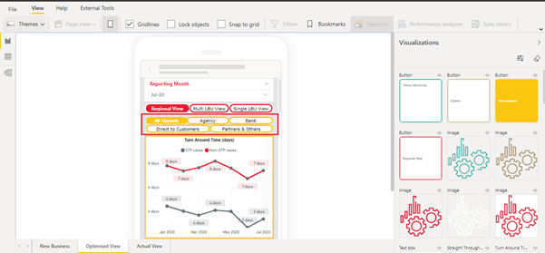
Here is a mobile view screenshot of a Power BI report we currently have.
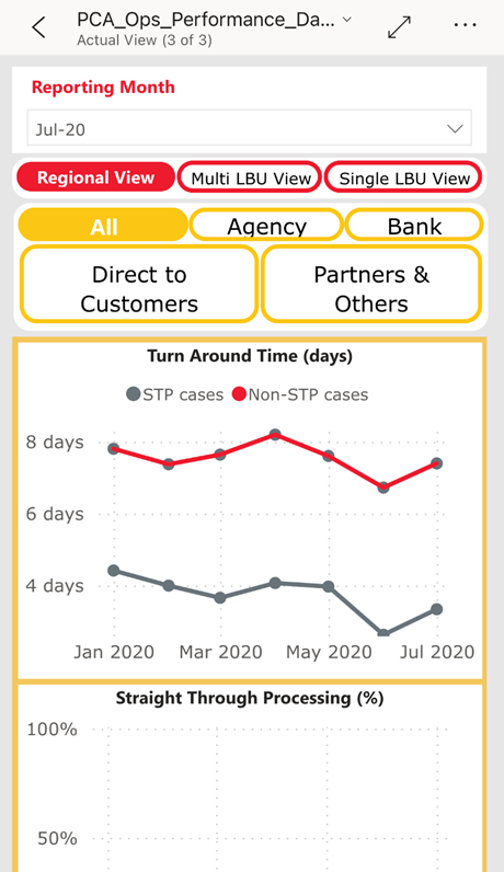
While it does not look particularly messy or hard-to-read, it is not optimised for mobile view. Below are screenshots of the mobile view after we make a few changes.
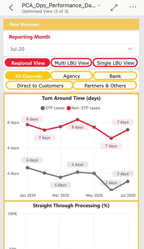
With some simple changes, the After screenshots have managed to provide a much cleaner look and feel without changing the web layout. To achieve this and allow for a better user experience, follow these 3 tips for an optimised Power BI Dashboard.
1. Having separate buttons with smaller font size
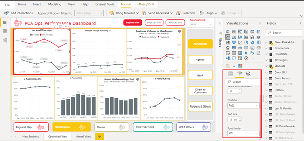
Here, we have created a separate set of icons (Mobile Buttons) with smaller font size, so they look better on mobile. We push back these new icons to the back of existing graphs so they will not impact the web layout.
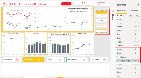
In mobile view, we use these new Mobile Buttons from the available visualizations.
2. Creating a copy of Graphs with the following modifications for mobile layout
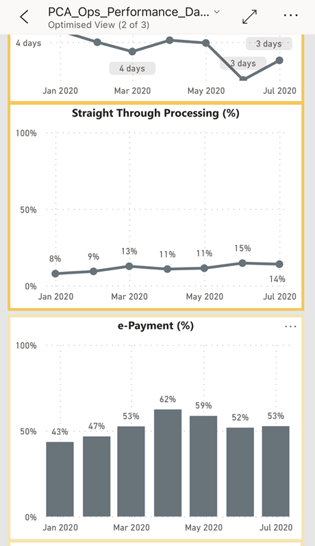
• Enable Data Labels so mobile view users can directly see the values. Having to direct a cursor over on data point to view data value is not optimal in mobile view.
• Use smaller font size for Axis, Data Labels, Headers, and more so they look better in mobile view.
As the copied Graphs will be pushed to the back of the original graphs, they will not affect the web view.
3. Adding header for the mobile view
This is a very simple tip, yet having a header at the top of the dashboard that tells users which page they are in means less mindless scrolling for mobile users.
We hope these tips help you with your Power BI Mobile optimisation. If you have any inquiries on Power BI or other business intelligence strategies, do not hesitate to contact us!
.svg)

.svg)