

One way to measure your business performance is by retracing your data during a period of time. In Power BI, this can be achieved by displaying the Last N Months (e.g. last 12 months) data in your charts. Here is how you can do this.
The DAX logic that is used to display Last N Months data is simple. Rather than creating new measures for Last N Months, we will be using a Calculation group. This way, we will be able to use a single group for all existing/new measures in our model instead of having to create new measures for every other measure required to show the N months data.
It is important to note that by putting the Month from the existing Period Dimension (which we use for the Slicer and Calculation groups) will not work in charts to show N months.
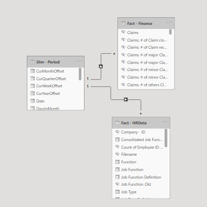
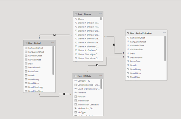
Here, we are not going to use Period columns from Facts as they will not allow us to use measures from different Facts in a single chart. We are going to model a copy of the existing Period Dimension which helps in charts that contain measures from different Facts.
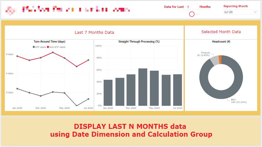
The final report will look like this.
 For the purpose of this post, we will be using a very simple model that contains 2 Fact Tables and a Period Dimension table.
Now, we will follow the steps below to reach our final result.
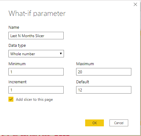
Step 1: Add What-if parameter for Last N Months selection
Add the “Last N Months Slicer” parameter as shown here.
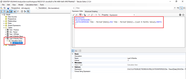
Step 2: Add Calculation group for Last N Months data
Open the Tabular Editor extension from Power BI tool and create a new Calculation group with the following formula using the DATESINPERIOD function and Last N Months slicer we have created above. This step helps avoid the need of creating new measures to which we want to show N months data in graphs. We will later show how to use this calculation group to show N months data in different graphs.
CALCULATE (
SELECTEDMEASURE (),
DATESINPERIOD (
'Dim - Period'[Date],
MAX ( 'Dim - Period'[Date] ),
- [Last N Months Value],
MONTH
)
)
Step 3: Add a Period Dimension copy and model it
Create a copy of the existing Period Dimension in the Power Query and join it with Facts in the modelling tab, just like the existing Period Dimension. The final model will look like this.
Step 4: Create charts using the Period Dimension copy and Calculation group
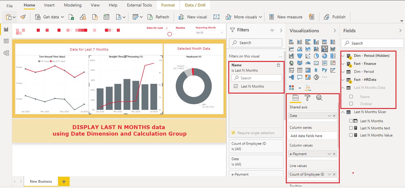
In this step, we need to select measures of which N months data we want to display in the graphs and select the Date column from the Period Dimension copy (Dim - Period (Hidden)) in Axis.
Put a filter on the Name column from Last N Months Data Calculation group as below.
As we use the Calculation group, we can show Last N Months data for any existing/new measure in the model.
Below, the 2 charts show the data for Last N Months based on the slicer selections.
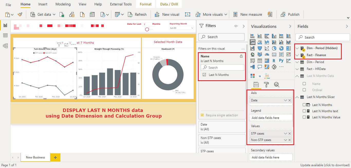 We can also select measures from different Facts as we are using a common Period Dimension copy with Axis.
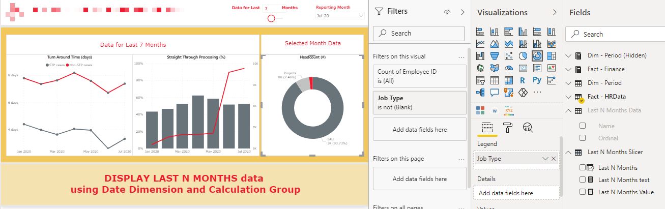
 In the same report, we can have other graphs to only show data for selected Period in the slicer. For instance, the Headcount(#) chart below shows only data for the selected Period.
Did you find this post helpful? Keep an eye out on our blog for more technical know-how like this and talk to us if your organisation has any Business Intelligence needs.
.svg)

.svg)