
Transportation companies have traditionally been hindered in planning, managing and evaluating their services by having to depend heavily on costly and unreliable manual data collection systems. The complex and dynamic nature of transportation makes the use of Big data all the more important and the perfect use-case.
Just Analytics has designed a Transport Analytics report which can help to organise all your important data in a manner that is intuitive and easy to manoeuvre. It utilises visuals to convey information, enabling you to view your most important operational KPI’s captured such as your profit and loss, headcount and energy consumption. The use of analytics can help to drive efficiency improvement and optimisation, signalling out errors and unnecessary spending. With a better understanding over your company data, your organisation will be one step closer to achieving your goals and objective.
Some of the key features of the report are detailed below:
1. Interactive P&L
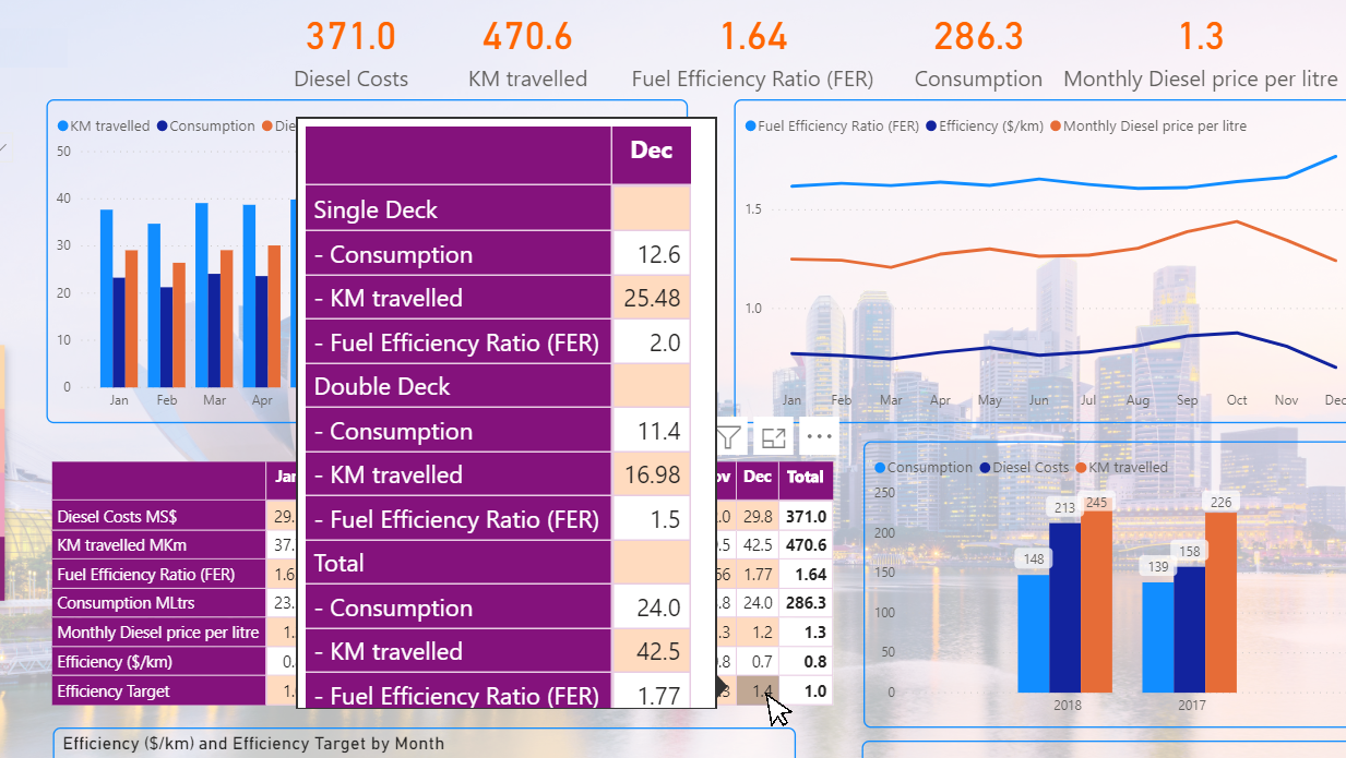
Most organisations are used to P&L statements that are either very detailed or condensed, depending on who they are presenting the information to. What if you could have both options at your disposal? Providing you with the ability to expand and get more information or collapse the details when you require just the total numbers? Here, we have created that function for you. Looking at the images below, you will see that clicking on the “+” sign next to Fare Revenue will allow you to see a full detailed breakdown of the various constituents of the total fare revenue and clicking it another time will minimise the breakdown.
.png?width=1521&name=Interactive%20PL%202%20-%20Copy%20(2).png)
2. Comparison between time periods
One question you might commonly ask or be asked is, “How are we doing compared to last year/period?” This Transport Analytics report has an in-built function which allows you to compare data between time periods. Not only can it compare data between years, but it can also be done between months. This way, your organisation will be able to measure the growth between these two time periods. This will give your organisation a clearer view if improvements are to be made to current operations. Or to continue doing what you’re doing because success has been proven from the current operation of things.
3. Tooltip for more information
Tooltips are a great way to providing more information and detail to a data point. It appears by hovering over the data point. Customised tooltips help provide additional context and information for users viewing the visual, explaining with what business parameters the result was calculated with. It enables you to specify additional data points such as instructions, explanations, remarks and calculations that display as part of the tooltip. This is a great way to save space and present only the important information.
Has this piqued your interest? Want to find out more? Contact us at for a complimentary demo to showcase what insights can be delivered to achieve your business goals and objectives.
.svg)

.svg)